Randy Lewis
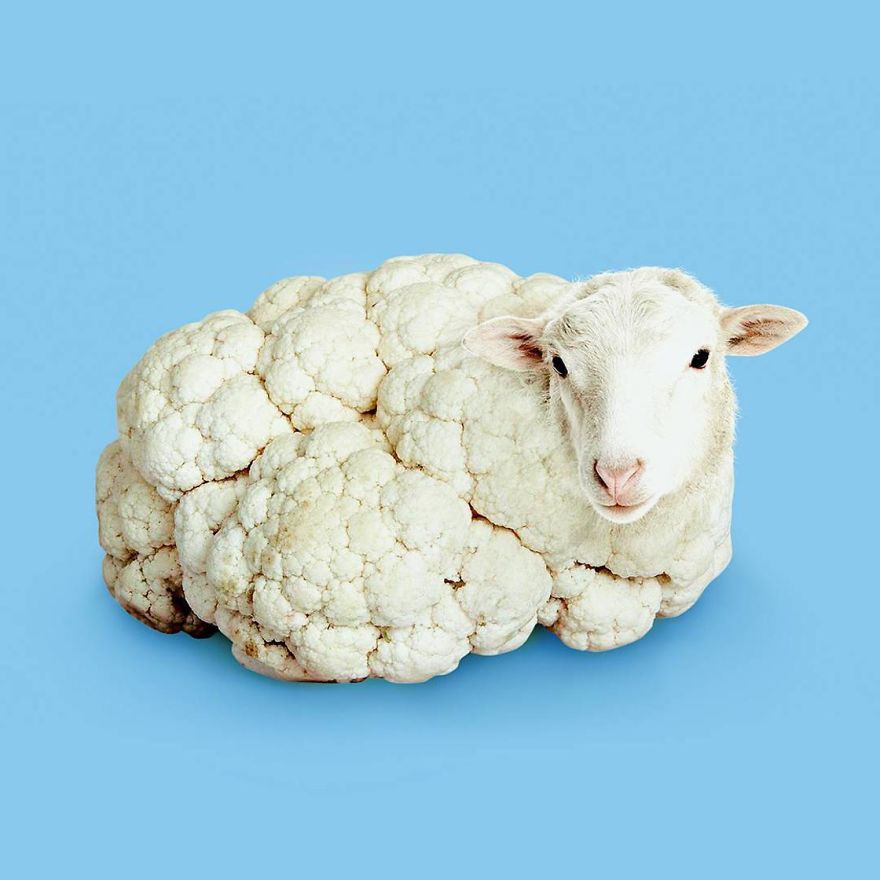
This an interesting artwork created by Randy Lewis. Unfortunately, I could not find the name of the artwork. However, I decided to use it anyway because the second I came across this picture I was sure this was an artwork I would like to assess. This is a cauliflower sheep. And I love it! It seems so simple, but I really enjoy looking at this artwork. I like the way the artist has photoshopped the sheep’s head onto the cauliflower so it looks like a very wooly sheep with it’s legs tucked under. I also like the way the artist has seen the pink on the sheep’s nose and in it’s ears. Then the artist has used a cornflower looking blue to make the pink pop, but not too much. Overall, like the first artwork I posted about, it was inspiring to look through Randy Lewis’s work on Pinterest.
Paul Fuentes

This is an artwork by Paul Fuentes called Bubble Gum Tape. I believe this was created using Adobe Photoshop. I assume there was two different pictures, one of a bubble gum roll, and one of a tape dispenser but now they have been combined to create this picture. I like the colour choice for the tape dispenser and the colour choice for the background. The artist did a good job of choosing colours that complement each other but don’t stand out too much. There isn’t anything I dislike about the artwork. This artist’s work is so amazing to look through. I loved to look through his conceptual art on pinterest. I would really like to use his work as inspiration for my work.
Ron Magnes

This artwork is called Chinese Takeout on Blue and it was created by Ron Magnes. I think this artwork was made by sketching on a piece of paper, in an art book or on a drawing application. It looks like it was then put on a drawing application (one such as illustrator) when the artist used digital tools to make their image more definite. By looking at this artwork I see a lot of straight lines, so I assume that the artists used an isometric grid or a plain squared one. I admire how the artist has used lines to create tone and the illusion that the object is 3D. I also like how the smooth lines and the even space between them makes the artwork satisfying to look at. Something that I dislike is the shade of blue used for the background. For me, it takes away the calmness and satisfaction that I feel. I would of preferred if it was a more purple-blue tone, like the one on the left side of the logo on the front of the takeout box.
Kode Logic

This artwork is called ‘What we used to be’, by Kode Logic. I believe this artwork was created using a computer application with a cursor as the brush or with a USB connected drawing pad and stylus. A lot of aspects in this artwork are appealing to me. I especially like the beautiful way the artist has illustrated the tiny sky behind the drawbridge. The whispy strokes are mesmerising. I also admire the way the artist drew the children in different shades of grey, then highlighted the characters with a splash of coloured light. It highlights the imaginative world of a child. The only thing I would change is the intensity of the pink as I feel it clashes with the cool teal and gold hue. However, despite my personal opinion, I respect that the artist decided to use this colour because it’s a bold choice. Overall, this artwork is amazing, and so are the other illustrations this artist has presented to us.
Steve McGhee

This artwork is called ‘The Art for the End of the World’. It was illustrated by Steve McGhee. To me, it looks like this artwork was created in Adobe Photoshop. I believe this because it looks like layers of photos have been combined. This artwork is very interesting. I really admire the way the artist has made the artwork realistic by illustrating the rising withdrawing water around the buildings. There isn’t anything about this artwork that I would change. I enjoyed looking through Steve McGhee’s artwork. His surreal looking photos are fascinating!
Marc Sarmel

This is an exquisite digital artwork created by Marc Sarmel. This piece is called ‘Water Sprites’. I assume this artwork was created using a drawing application. This artist’s style is really appealing to me. I love the use of solid shapes to define and highlight the character’s facial features. I also value the artist’s choice of purple and crimson shades. The way the artist blended the head scarfs into one another to make the three women look like one was clever. I am not completely fond of the pinky purple smoky streaks that rise to the top of the artwork. Only because they cover two of the women. Personally, I would’ve preferred they did not go over these characters and instead flowed around them. Despite my opinion, I respect the artists’ choice. This artist creates fabulous illustrations that I recommend for inspiration or for pleasure.
Rich Davies

This piece is a poster by Rich Davies. It is inspired by the movie Hidden Figures. Hidden Figures is a wonderful movie based on the true story about three African American mathematicians who worked in NASA. Their names were/are Katherine Johnson, Mary Jackson and Dorothy Vaughan. I believe this may be created on a computer program (eg. Illustrator) using a drawing tablet, or cursor. A lot of things about this artwork are appealing to me. For example the fine details in the hair of the women and adding lighter colours to define the curls. I admire the highlights on the faces of the characters and the way the artist has made the choice not to blend it in with the skin tone. The focal point of the poster is the rocket, with clouds of gas around it. The clouds are lit bright orange directly where the rocket is. This makes the poster look more realistic and draws more attention to the eye of the viewer. Everything about this artwork is magnificent! I also thoroughly enjoyed looking through Rich Davies’ other pieces. He mainly does portraits of pop culture characters.
