Illustrator Portrait – Finished

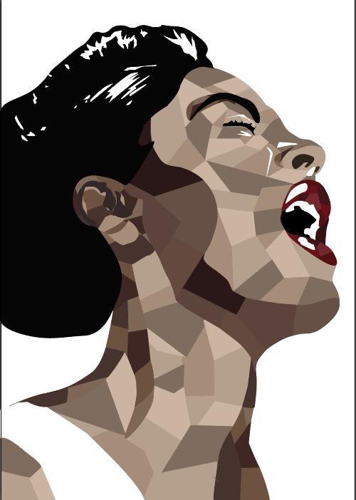
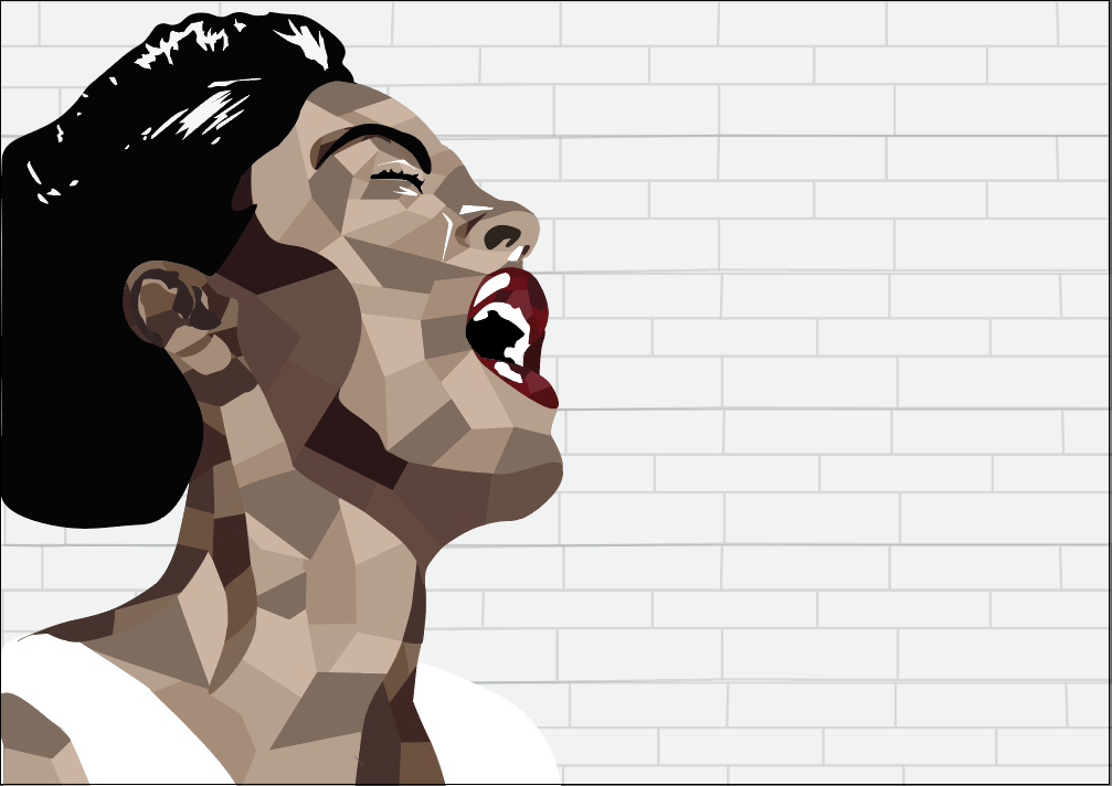
This is my final post for this project! I have had an enjoyable journey drawing this artwork, but I am glad to be completed. I used a small amount of tools during the creation of this artwork. Those tools are the Pen Tool, which allows you to draw the shapes or add and delete anchor points. The select tool, which is very helpful when you need to size up or down a shape. Direct Selection Tool, this tool helps you create the curves in your shapes with anchor points. The Eyedropper Tool assisted me in keeping the colours consistent across the artwork. The Hand Tool was very useful and allowed me to move around the page by clicking and dragging. Finally, the most useful tool was the Zoom Tool. It was incredibly easy to access as the shortcut is the letter z. It was also good to be able to zoom out with just a simple click and drag so I could so my progress. Something that challenged me over this project was my change in vision. Sometimes artists can see a picture in their ind and then start their artwork. However I had a million pictures in my mind. Every time I would finish a session, promising myself that next time I would do this or do that, I ended up thinking of doing something else! The way I overcame this was just accepting that my vision was going to change. I suspect that it would be the same for other artists as well. Sometimes you don’t just have one idea, you have many, but if you combine them it can turn out better than your original idea. I think the most successful part of my artwork is how the shapes turned out. I was worried that if I did these shapes the viewer would believe they are too much, or unnecessary. However, I believe they turned out very well and instead of being too much, they were just right. They make Billie Holiday pop from the background. This was a very inspiring and joyful project, I look forward to doing more like it.

Illustrator Portrait – Progress Report #3

My work has progressed really well! Since my last progress report, I have made a big change. I have divided the separate tones into shapes and shades. This was a pretty simple task, it just takes a bit of time. It took me two sessions to successfully achieve this. The only difficulty I faced was when using the pen tool to make a new shape, sometimes I would accidentally delete one of the anchor points for the other shapes. This would be quite annoying and I would have to take back the steps so I could fix this problem. I like that at this stage in the artwork it is more complex looking than the last progress report, but not so complex that it hurts your eyes. Next, I will add a background. I will use the ideas from my last progress report and try them out. My next post will be my finished artwork.

Illustrator Portrait – Progress Report #2

This is my second progress report! I am happy to say I have smoothed out the sections and I’m proud of how it looks. The main difficulty in progressing from the last point to this one was definitely having to add and delete anchor points to curve the lines. It was a painful process as while I was roughly sectioning of the parts I may have put one or twenty too many anchor points and in some sections barely any in other sections. Something I dislike about my artwork is how plain it looks. The colours are solid and uninteresting. However, I do admire the simplicity. This makes the lips and the white highlights glow. What I have to do next is pick a background. I have a few ideas. I could do a mirror effect and replicate the artwork and lower the opacity so it looks like she is fading out of the picture. Or I could find one of her albums and use the cover’s background. I will update my decision in the next progress report.

Illustrator Portrait – Progress Report #1

For my Illustrator Portrait, I chose to do Billie Holiday (Eleanora Fagan). Illustrator is an Adobe application that allows you to create vector art. I chose Billie Holiday because of her incredible influence over jazz and blues music.

My progress is going good so far. I have had two hours to work on this project and I’ve successfully roughly sectioned off my tones. The difficult component in creating the artwork is definitely the fact that I am not completely familiar with the Illustrator program yet. Lucky for me, I have my Digital art teacher and the world wide web to help me. Some difficulties I faced when not knowing how to operate the program entirely was making my edges soft. As you can see I’ve ‘roughly’ sectioned the tones off when in actual reality, that’s the smoothest I could get it. Hopefully, by my next progress report, I have been able to fix that problem.

Aspects of my artwork that I like include the mouth region, for some reason, I admire how the teeth turned out. I also like how I have done the highlights around the eyes to accentuate them. Something I dislike about the artwork is the ear. I haven’t been able to successfully section the tones in that area, it’s still a working progress. My vision is to see the sections smoother and in colour, (using a natural skin tone palette). I also want the lips to stand out, so I plan on making them an alternative colour to complement the browns, I’m thinking rose-red.

Rich Davies – Research Task

This piece is a poster by Rich Davies. It is inspired by the movie Hidden Figures. Hidden Figures is a wonderful movie based on the true story about three African American mathematicians who worked in NASA. Their names were/are Katherine Johnson, Mary Jackson and Dorothy Vaughan. I believe this may be created on a computer program (eg. Illustrator)  using a drawing tablet, or cursor. A lot of things about this artwork are appealing to me. For example the fine details in the hair of the women and adding lighter colours to define the curls. I admire the highlights on the faces of the characters and the way the artist has made the choice not to blend it in with the skin tone. The focal point of the poster is the rocket, with clouds of gas around it. The clouds are lit bright orange directly where the rocket is. This makes the poster look more realistic and draws more attention to the eye of the viewer. Everything about this artwork is magnificent! I also thoroughly enjoyed looking through Rich Davies’ other pieces. He mainly does portraits of pop culture characters.

Marc Sarmel – Research Task

This is an exquisite digital artwork created by Marc Sarmel. This piece is named ‘Water Sprites’. I assume this artwork was created using a drawing application. This artist’s style is really appealing to me. I love the use of solid shapes to define and highlight the character’s facial features. I also value the artist’s choice of purple and crimson shades. The way the artist blended the head scarfs into one another to make the three women look like one was clever. I am not completely fond of the pinky purple smoky streaks that rise to the top of the artwork. Only because they cover two of the women. Personally, I would’ve preferred they did not go over these characters and instead flowed around them. Despite my opinion, I respect the artists’ choice. This artist creates fabulous illustrations that I recommend for inspiration or for pleasure.

Steve McGhee – Research Task

This artwork is called ‘Art for the End of the World’. It was illustrated by Steve McGhee. To me, it looks like this illustration was created in Adobe Photoshop. I believe this because it looks like layers of photos have been combined. This piece is very interesting. I really admire the way the artist has made the artwork realistic by illustrating the crashing water around the buildings. There isn’t anything about this artwork that I would change. I enjoyed looking through Steve McGhee’s collection. His surreal looking photos are fascinating!

Kode Logic – Research Task

This artwork is called ‘What we used to be’, by Kode Logic. I believe this artwork was created using a computer application with a cursor as the brush or with a USB connected drawing pad and stylus. A lot of aspects in this artwork are appealing to me. I especially like the beautiful way the artist has illustrated the tiny sky behind the drawbridge. The whispy strokes are mesmerising. I also admire the way the artist drew the children in different shades of grey, then highlighted the characters with a splash of coloured light. It highlights the imaginative world of a child. The only thing I would change is the intensity of the pink as I feel it clashes with the cool teal and gold hue. However, despite my personal opinion, I respect that the artist decided to use this colour because it’s a bold choice. Overall, this artwork is amazing, and so are the other illustrations this artist has presented to us.