Human Rights – Progress #2

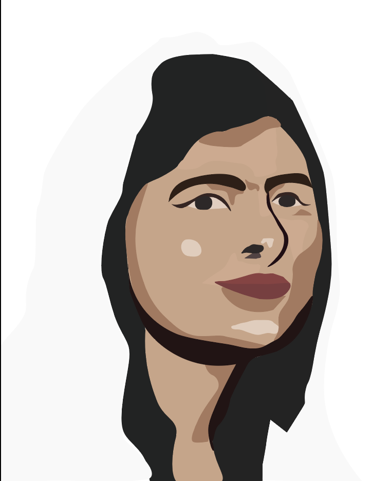
This is my first progress shot. My work has been progressing well, considering that I missed a few sessions. I went for the basic vector portrait, because I don’t want the image to take too much from the text. There is one major difficulty that I have been facing through this whole artwork. The difficulty is my vision. I haven’t been able to decide on what I really wanted for my project. So I’ll start my work, then change my idea, and that starts to take up my time and cloud my vision. Something I dislike about my work is how the lines are edgy and need smoothing, which is something I can fix easily. Next I will add text and implement the design principles ‘hierarchy’.

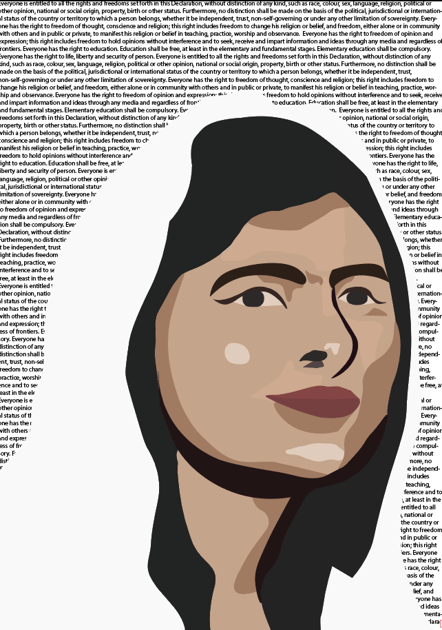
This is my second and last progress shot before I will reveal my final project. although this shot looks very similar to the last one, some careful planning went in place. At first, I thought it would be a good idea to place the declaration for freedom of speech, right to education, and the right to life in Malala’s hijab. However I tried putting my final text over that and it looked too messy and convoluted. So I tried putting it in the background and that was more successful. Next, I will be adding the final text and then posting my evaluation.

Here is the link to the site where I got the declaration from. (The United Nations Universal Declaration Of Human Rights) https://www.un.org/en/universal-declaration-human-rights/

So this is my third and last progress shot before the final artwork! It may look like the final artwork but there is a few things I dislike and feel the urge to change.

Firstly, I think the white, bold text is encroaching the borders of the artwork and gives off a crowded effect. Secondly, one of the design principles that was given to us as a topic was contrast. And right now, nothing is contrasting with anything.

So looking forward, I will change the colour of something (most likely the hijab), so that contrast is implemented. Also, I will be playing around with the text to make it more satisfying.

Human Rights – Progress

For the past two lessons, we have been creating plans for our human rights poster. These are two rough plans that I think work well with my theme of fighting for equality.

In this plan, I have two unidentified figures holding hands in a protest. Then, within the shape of their bodies, I have incorporated text containing information about the right to freedom of speech.

For this plan, I have included four iconic figures who have paid a high price for their belief in fundamental human rights. Firstly there is Emily Davison, a suffragette who died in the course of protesting. She was run over by a horse. One of the most recognisable civil rights advocates, Martin Luther King Jr, was assassinated after delivering a powerful speech on race that later became known as the “I have a dream” speech. John Lennon was a talented musician as well as a committed peace activist. He was shot by a crazed fan who accused him of being ‘fake’. Finally, Malala Yousafzai was shot by the Taliban on her way to school. She was the only one out of the four figures to survive. Now she advocates for the rights of girls to be educated all over the world.

I am not completely happy with how my work has been progressing. It has been a little slow lately and I haven’t had any inspiring and captivating ideas for my poster. Some aspects I like about my plans include; the idea of incorporating multiple human rights activists. Also, the idea of combining illustration with the text, information, or deceleration of human rights. One problem I have with my second plan is that all the activists were shot, instead of Emily Davison. I reckon if I am to use this idea in my poster, I will need to find a new activist to uphold the theme. Next I’ll be working on my actual poster! I will combine the work from my research, mind maps, and plans to create an interesting and informative human rights poster.

Human Rights – Research

I did some research about human rights, as for the next project we are required to make a poster advertising one of the human rights.

I looked up the Australian Human rights and picked a few that interested me or that I felt I had to work with. I mainly chose rights for equality. Equality rights for children, for women, for people will a different cultural background or belief.

We then conducted research to find posters that fitted out interest in the topic and in design. I chose the collection of ‘We The People’ posters.

I chose these posters because I admire the way the artist has chosen the colours of the American flag and incorporated it into the people to symbolise that the people are what make the country. I notice how the writing is minimalist but it grabs your attention. This is an effective way to convey a message without making the reader feel overwhelmed.

My plans for the topic of my poster are to be developed. However, currently I am looking towards equality for all people.

Art of the Everyday – Finished

This is my final evaluation. I am happy with the artworks I have created in this project. First is a drawing of a stopwatch with a wet paint texture. Second is a lemonade can with a smooth crayon texture. Lastly is a book with a rough crayon texture.

I used many photoshop tools in this process. Tools such as the paintbrush tool which allowed me to create solid colours. The select tool, which would allow me to make a rectangular mask around something I wanted to select. The move tool, which is a tool that I could use to move a drawing or texture around the page. The magic wand tool, which automatically selects the parts of a drawing with the same colour. Sometimes, your drawing will have a gap in it, so the magic wand tool doesn’t end up highlighting the parts you had wished it would. The way to fix this is by using the polygon tool. The polygon tool lets you outline the area you want to be highlighted.

The Art Elements I mainly focused on were; colour and texture. Texture mostly in the artwork or the book. The Art Principles that I focused on were space and composition.

The challenging bit about this project was my lack of knowledge regarding the program. We did have a few lessons and lots of help, but I never was able to use the program properly and I always had something troubling me. I overcame this challenge by asking for more help or looking back to my previous artworks.

I believe that the most successful part of my artworks are the colour filters I have put over them. By using these, I have emphasised the objects.

Overall, I am proud of my artworks and am excited about the next project.

Art of the Everyday – Progress Report #3

For this experiment, I used my knowledge of photoshop to help me add two textures to an image and then copy, paste and adjust the image to create this artwork. For the textures I used my rough oil pastel for the flowers and my smooth watercolour for my leaves and stem. For the drawing, I used the book ‘the sun and her flowers’. I am very happy with the progress of this artwork. It shows me that I am able to add two different textures using my knowledge of layers. I am also able to adjust the image using filters such as ‘darken’ and ‘colour burn’ to make the image look much more interesting. Something difficult about this task is the use of adjustments and filters. I’m not completely used to the application yet, so when I was applying filters and adjustments, I was practically guessing. I’m sure with more use, I will be able to create an even better artwork. Next, I will start my project. I will use the information from my last progress reports to create three complete, official artworks.

Art of the Everyday – Progress Report #2

We recently figured out how to apply texture to our drawings! I used my skills from the drawing exercise to delete the white spaces in the image and add texture. For this test I used my drawing of a lemonade can, and my wet paint texture. I also experimented with a solid colour with no texture. This gave me this result here. I am happy with my progress this lesson, because not only have I been able to add the texture, I’ve been able to do it on time. Difficulties that I have to look out for in the future are problems regarding the lines I’ve drawn. As you can see at the top of my can, I’ve drawn lots of lines to depict the curve of the can. If I was to use the magic wand tool, it wouldn’t highlight all the little spaces between the lines. It would highlight one. This will be a long process if for my images I have to highlight one at a time. Luckily, I am working on being able to highlight multiple areas at once. This can happen using the control key. Something I dislike about the artwork would be the colour I chose for the solid texture. I believe it gives the artwork a really dull spin. I’m not fond of it. In the next progress report, I will be experimenting with texture, drawings and image adjustments.

Art of the Everyday – Progress Report #1

This is my first progress report. As it is my first, I will be explaining the project as well.

For the Art of the Everyday subject, we drew four different everyday objects. These objects could be as simple as ear phones, or as meaningful as a family heirloom. We drew these objects using a 2B pencil, and then we defined the objects using lines and shapes. Then, we had to create textures. We could use oil pastels to create a smooth or grainy texture. Water colour to create a watery or strong colour. And paint to create a wet or dry texture. Once we had finished the drawings and the textures, our teacher scanned them onto her computer and sent us the pdf. From there, we downloaded our own artworks and saved them to our computers. We will eventually combine the textures with the drawings on Photoshop to create a completed artwork.

Firstly, we tested out copying and pasting the image. We used the layer bar to control what order we placed images in. We also used the move tool and select tool to move the pictures around the canvas. Finally, I used the magic wand tool, a tool that helps you select bigger spaces in a quick amount of time. This is good when you want to delete an area to show a texture from the layer before. Or to make the object transparent. Aspects of this part of photoshop I would like to work on are learning how to use the tools more quickly and efficiently. This is because while editing in the lesson, I fell behind due to confusion. But with practice, I will be able to use these tools quickly and accurately.

Randy Lewis – Research Task

This Artist Confuses Our Minds With His Surreal Images

This an interesting artwork created by Randy Lewis. Unfortunately, I could not find the name of the artwork. However, I decided to use it anyway because the second I came across this picture I was sure this was an artwork I would like to assess. This is a cauliflower sheep. And I love it! It seems so simple, but I really enjoy looking at this artwork. I like the way the artist has photoshopped the sheep’s head onto the cauliflower so it looks like a very wooly sheep with it’s legs tucked under. I also like the way the artist has seen the pink on the sheep’s nose and in it’s ears. Then the artist has used a cornflower looking blue to make the pink pop, but not too much. Overall, like the first artwork I posted about, it was inspiring to look through Randy Lewis’s work on Pinterest.

Paul Fuentes – Research Task

This is an artwork by Paul Fuentes called Bubble Gum Tape. I believe this was created using Adobe Photoshop. I assume there was two different pictures, one of a bubble gum roll, and one of a tape dispenser but now they have been combined to create this picture. I like the colour choice for the tape dispenser and the colour choice for the background. The artist did a good job of choosing colours that complement each other but don’t stand out too much. There isn’t anything I dislike about the artwork. This artist’s work is so amazing to look through. I loved to look through his conceptual art on pinterest. I would really like to use his work as inspiration for my work.

Ron Magnes – Research Task

This artwork is called Chinese Takeout on Blue and it was created by Ron Magnes. I think this artwork was made by sketching on a piece of paper, in an art book or on a drawing application. It looks like it was then put on a drawing application (one such as illustrator) when the artist used digital tools to make their image more definite. By looking at this artwork I see a lot of straight lines, so I assume that the artists used an isometric grid or a plain squared one. I admire how the artist has used lines to create tone and the illusion that the object is 3D. I also like how the smooth lines and the even space between them makes the artwork satisfying to look at. Something that I dislike is the shade of blue used for the background. For me, it takes away the calmness and satisfaction that I feel. I would of preferred if it was a more purple-blue tone, like the one on the left side of the logo on the front of the takeout box.